Why It Matters and Why It's Real
Report • By Josh Bivens and Lawrence Mishel • September 2, 2015
Introduction and key findingsWage stagnation experienced by the vast majority of American workers has emerged as a central issue in economic policy debates, with candidates and leaders of both parties noting its importance. This is a welcome development because it means that economic inequality has become a focus of attention and that policymakers are seeing the connection between wage stagnation and inequality. Put simply, wage stagnation is how the rise in inequality has damaged the vast majority of American workers.
The Economic Policy Institute's earlier paper, Raising America's Pay: Why It's Our Central Economic Policy Challenge, presented a thorough analysis of income and wage trends, documented rising wage inequality, and provided strong evidence that wage stagnation is largely the result of policy choices that boosted the bargaining power of those with the most wealth and power (Bivens et al. 2014). As we argued, better policy choices, made with low- and moderate-wage earners in mind, can lead to more widespread wage growth and strengthen and expand the middle class.
This paper updates and explains the implications of the central component of the wage stagnation story: the growing gap between overall productivity growth and the pay of the vast majority of workers since the 1970s. A careful analysis of this gap between pay and productivity provides several important insights for the ongoing debate about how to address wage stagnation and rising inequality. First, wages did not stagnate for the vast majority because growth in productivity (or income and wealth creation) collapsed. Yes, the policy shifts that led to rising inequality were also associated with a slowdown in productivity growth, but even with this slowdown, productivity still managed to rise substantially in recent decades. But essentially none of this productivity growth flowed into the paychecks of typical American workers. Second, pay failed to track productivity primarily due to two key dynamics representing rising inequality: the rising inequality of compensation (more wage and salary income accumulating at the very top of the pay scale) and the shift in the share of overall national income going to owners of capital and away from the pay of employees. Third, although boosting productivity growth is an important long-run goal, this will not lead to broad-based wage gains unless we pursue policies that reconnect productivity growth and the pay of the vast majority.
Ever since EPI first drew attention to the decoupling of pay and productivity (Mishel and Bernstein 1994), our work has been widely cited in economic analyses and by policymakers. It has also attracted criticisms from those looking to deny the facts of inequality. Thus in this paper we not only provide an updated analysis of the productivity–pay disconnect and the factors behind it, we also explain why the measurement choices we have made are the correct ones. As we demonstrate, the data series and methods we use to construct our graph of the growing gap between productivity and typical worker pay best capture how income generated in an average hour of work in the U.S. economy has not trickled down to raise hourly pay for typical workers.
Key findings from the paper include:
- For decades following the end of World War II, inflation-adjusted hourly compensation (including employer-provided benefits as well as wages) for the vast majority of American workers rose in line with increases in economy-wide productivity. Thus hourly pay became the primary mechanism that transmitted economy-wide productivity growth into broad-based increases in living standards.
- Since 1973, hourly compensation of the vast majority of American workers has not risen in line with economy-wide productivity. In fact, hourly compensation has almost stopped rising at all. Net productivity grew 72.2 percent between 1973 and 2014. Yet inflation-adjusted hourly compensation of the median worker rose just 8.7 percent, or 0.20 percent annually, over this same period, with essentially all of the growth occurring between 1995 and 2002. Another measure of the pay of the typical worker, real hourly compensation of production, nonsupervisory workers, who make up 80 percent of the workforce, also shows pay stagnation for most of the period since 1973, rising 9.2 percent between 1973 and 2014. Again, the lion's share of this growth occurred between 1995 and 2002.
- Net productivity grew 1.33 percent each year between 1973 and 2014, faster than the meager 0.20 percent annual rise in median hourly compensation. In essence, about 15 percent of productivity growth between 1973 and 2014 translated into higher hourly wages and benefits for the typical American worker. Since 2000, the gap between productivity and pay has risen even faster. The net productivity growth of 21.6 percent from 2000 to 2014 translated into just a 1.8 percent rise in inflation-adjusted compensation for the median worker (just 8 percent of net productivity growth).
- Since 2000, more than 80 percent of the divergence between a typical (median) worker's pay growth and overall net productivity growth has been driven by rising inequality (specifically, greater inequality of compensation and a falling share of income going to workers relative to capital owners). Over the entire 1973–2014 period, rising inequality explains over two-thirds of the productivity–pay divergence.
- If the hourly pay of typical American workers had kept pace with productivity growth since the 1970s, then there would have been no rise in income inequality during that period. Instead, productivity growth that did not accrue to typical workers' pay concentrated at the very top of the pay scale (in inflated CEO pay, for example) and boosted incomes accruing to owners of capital.
- These trends indicate that while rising productivity in recent decades provided the potential for a substantial growth in the pay for the vast majority of workers, this potential was squandered due to rising inequality putting a wedge between potential and actual pay growth for these workers.
- Policies to spur widespread wage growth, therefore, must not only encourage productivity growth (via full employment, education, innovation, and public investment) but also restore the link between growing productivity and the typical worker's pay.
- Finally, the economic evidence indicates that the rising gap between productivity and pay for the vast majority likely has nothing to do with any stagnation in the typical worker's individual productivity. For example, even the lowest-paid American workers have made considerable gains in educational attainment and experience in recent decades, which should have raised their productivity.
Growing together then pulling apart: Productivity and compensation in the postwar era
Productivity is simply the total amount of output (or income) generated in an average hour of work. As such, growth in an economy's productivity provides the potential for rising living standards over time. However, it is clear by now that this potential is unrealized for many Americans: Wages and compensation for the typical worker have lagged far behind the nation's productivity growth in recent decades, and this reflects a break in a key transmission mechanism by which productivity growth raises living standards for the vast majority of workers.
That this has not always been the case is seen in Figure A, which presents the cumulative growth in both net productivity of the total economy (inclusive of the private sector, government, and nonprofit sector) and inflation-adjusted average hourly compensation of private-sector production/nonsupervisory workers since 1948.1 Given that this group comprises over 80 percent of private payroll employment, we often label trends in its compensation as reflecting the "typical" American worker.
Disconnect between productivity and a typical worker's compensation, 1948–2014
Note: Data are for average hourly compensation of production/nonsupervisory workers in the private sector and net productivity of the total economy. "Net productivity" is the growth of output of goods and services minus depreciation per hour worked.
The hourly compensation of a typical worker essentially grew in tandem with productivity from 1948 to 1973. After 1973, these series diverge markedly. Between 1973 and 2014 productivity grew 72.2 percent, or 1.33 percent each year, while the typical worker's compensation was nearly stagnant, growing just 0.22 percent annually, or 9.2 percent over the entire 1973–2014 period. Further, nearly all of the pay growth over this 41-year period occurred during the seven years from 1995 to 2002, when wages were boosted by the very tight labor markets of the late 1990s and early 2000s. This divergence of pay and productivity has meant that the vast majority of workers were not benefiting much from productivity growth; the economy could afford higher pay but was not providing it.
Figure B provides another look at the post-1973 period using cumulative productivity growth (as did Figure A) but also displaying the cumulative growth of another measure of typical worker pay: hourly compensation (wages and benefits) of the median worker—that worker who earns more than half of all earners but less than the other half of earners. Between 1973 and 2014 the median worker's inflation-adjusted hourly compensation grew just 0.20 percent annually, and 8.7 percent in total. Thus, the growth of the median worker's compensation almost exactly mirrors the growth of production/nonsupervisory worker compensation shown in Figure A. Figure B also presents the growth in average hourly compensation—the average for all workers, including both top executives and low-wage workers—which rose 42.5 percent between 1973 and 2014. The gap between the growth of average and median hourly compensation reflects the growing inequality of compensation, as the highest-paid workers enjoyed far faster growth in their compensation.
Growth of productivity, real average compensation, and real median compensation, 1973–2014
Assessing the wedges between productivity and median compensation growth
In this section we provide an analysis of the "wedges" that create the divergence between the growth of net productivity and median worker compensation shown in Figure B. The analysis below is an update, and improvement, of the previous analysis of Mishel (2012), which drew heavily on Mishel and Gee (2012) and the decomposition framework developed by the Centre for the Study of Living Standards (Sharpe, Arsenault, and Harrison 2008a; Sharpe, Arsenault, and Harrison 2008b; Harrison 2009). We focus primarily on net productivity (productivity net of capital depreciation) but also present an analysis using gross productivity (as in Mishel 2012).
There are three important "wedges," or factors, between net productivity growth and the paychecks of typical American workers, paychecks that provide the foundation for their standards of living. As shown in Figure B, average hourly compensation—which includes the pay of CEOs and day laborers alike—grew just 42.5 percent from 1973 to 2014, lagging far behind the net productivity growth of 72.2 percent. In short, workers, on average, have not seen their pay keep up with productivity. This partly reflects the first wedge: an overall shift in how much of the income in the economy is received by workers in wages and benefits, and how much is received by owners of capital. As shown below (in Figure C), the share going to workers decreased, especially after 2000. We sometimes refer to this as the "loss in labor's share of income" wedge.
The second wedge, shown in the gap between the bottom two lines in Figure B, is the growing inequality of compensation, reflected in the fact that the hourly compensation of the median worker grew just 8.7 percent, far less than average worker compensation. Most of the growth in median hourly compensation occurred in the short period of strong recovery in the mid- to late 1990s; excluding 1995–2000, median hourly compensation grew just 2.6 percent between 1973 and 2014.
A third wedge important to examine but not visible in Figure B is the "terms-of-trade" wedge, which concerns the faster price growth of things workers buy relative to the price of what they produce. This wedge is due to the fact that the output measure used to compute productivity and net productivity is converted to real, or constant (inflation-adjusted), dollars based on the components of national output (GDP), while the compensation measures are converted to real, or constant, dollars based on measures of price change in what consumers purchase. Prices for national output have grown more slowly than prices for consumer purchases. Therefore, the same growth in nominal, or current dollar, wages and output yields faster growth in real (inflation-adjusted) output (which is adjusted for changes in the prices of investment goods, exports, and consumer purchases) than in real wages (which is adjusted for changes in consumer purchases only). That is, workers have suffered worsening terms of trade, in which the prices of things they buy (i.e., consumer goods and services) have risen faster than the prices of items they produce (consumer goods but also capital goods). Thus, if workers consumed investment goods such as machine tools as well as groceries, their real wage growth would have been better and more in line with productivity growth. We sometimes refer to this terms-of-trade wedge as the difference between "consumer" and "producer" price trends.
These wedges are illustrated in Figure C, which expands on Figure B by adding in two separate lines for average hourly compensation. The bottom of these two lines has average hourly compensation growth deflated by the "consumer" deflator, which is the same measure used to deflate median hourly compensation. The gap between this line and that of median hourly compensation growth (the bottom gap in our graph) reflects the gap associated with rising compensation inequality (remember, fast growth of compensation for the highest paid raises the average for everybody). We add another line for average hourly compensation growth deflated by the deflator for net domestic product, the "producer" deflator. The middle gap in our graph—the gap between the two average hourly compensation growth lines—solely reflects the divergence between consumer and producer price trends, thus illustrating the terms-of-trade gap. The top gap in our graph, between the average hourly compensation growth line deflated by producer prices and net productivity growth, reflects changes in labor's share of income.
Growth of productivity, real average compensation (consumer and producer), and real median compensation, 1973–2014
It is possible and useful to provide a quantitative breakdown of the importance of each of these wedges for key time periods since 1973, as some factors are more important in some periods than others. The appendix provides methodological details of this quantitative decomposition and the data sources employed. The results are provided in Table 1, which depicts the basic trends and identifies the contribution of each factor in driving the net productivity–median compensation gap and the gross productivity–median compensation gap in particular subperiods and overall from 1973 to 2014. The subperiods chosen are business cycle peaks—years of low unemployment—with some exceptions. The two business cycles, 1979–1989 and 1989–2000, are divided into the periods 1979–1995 and 1995–2000 to separate the period of low productivity growth (1973–1995) from the period starting in 1995 when productivity growth accelerated (and unemployment fell to low levels). The last two periods, 2000–2007 and 2007–2014, are, respectively, the first business cycle since 2000, and the period of the Great Recession and ongoing recovery through 2014, the most recent year of data.
Contributions to gap between median hourly compensation and productivity growth, 1973–2014
| 1973–1979 | 1979–1995 | 1995–2000 | 2000–2007 | 2007–2014 | 2000–2014 | 1973–2014 | |
|---|---|---|---|---|---|---|---|
| A. Basic trends (annual growth) | |||||||
| 1. Median hourly wage | -0.25% | -0.15% | 1.48% | 0.36% | -0.30% | 0.03% | 0.09% |
| 2. Median hourly compensation | 0.31% | -0.07% | 1.18% | 0.55% | -0.30% | 0.13% | 0.20% |
| 3. Average hourly compensation-consumer | 0.79% | 0.62% | 2.23% | 1.22% | 0.19% | 0.70% | 0.87% |
| 4. Average hourly compensation-producer | 1.08% | 1.03% | 2.74% | 1.39% | 0.43% | 0.91% | 1.20% |
| 5. Gross productivity | 1.10% | 1.37% | 2.33% | 2.14% | 1.05% | 1.59% | 1.52% |
| 6. Net productivity | 0.94% | 1.17% | 2.11% | 1.90% | 0.91% | 1.41% | 1.33% |
| 7. Gross productivity–median compensation gap | 0.79% | 1.45% | 1.14% | 1.58% | 1.36% | 1.47% | 1.32% |
| 8. Net productivity–median compensation gap | 0.63% | 1.25% | 0.92% | 1.34% | 1.22% | 1.28% | 1.13% |
| B. Explanatory factors for net productivity gap (annual growth) | |||||||
| Inequality of compensation | 0.48% | 0.69% | 1.04% | 0.66% | 0.49% | 0.58% | 0.66% |
| Loss in labor's share of income | -0.13% | 0.14% | -0.61% | 0.51% | 0.48% | 0.50% | 0.13% |
| Divergence of consumer and output prices | 0.28% | 0.41% | 0.50% | 0.17% | 0.24% | 0.20% | 0.33% |
| Total | 0.63% | 1.24% | 0.93% | 1.34% | 1.21% | 1.28% | 1.12% |
| Relative contribution to net productivity gap (percent of gap) | |||||||
| Inequality of compensation | 76.9% | 55.4% | 111.6% | 49.4% | 40.6% | 45.2% | 58.9% |
| Loss in labor's share of income | -21.2% | 11.4% | -66.0% | 37.8% | 39.9% | 38.8% | 11.5% |
| Divergence of consumer and output prices | 44.4% | 33.2% | 54.4% | 12.8% | 19.5% | 16.0% | 29.6% |
| Total | 100.0% | 100.0% | 100.0% | 100.0% | 100.0% | 100.0% | 100.0% |
| C. Explanatory factors for gross productivity gap (annual growth) | |||||||
| Inequality of compensation | 0.48% | 0.69% | 1.04% | 0.66% | 0.49% | 0.58% | 0.66% |
| Loss in labor's share of income | 0.18% | 0.18% | -0.60% | 0.66% | 0.52% | 0.59% | 0.23% |
| Divergence of consumer and output prices | 0.12% | 0.57% | 0.71% | 0.25% | 0.34% | 0.29% | 0.43% |
| Total | 0.78% | 1.44% | 1.15% | 1.57% | 1.35% | 1.46% | 1.31% |
| Relative contribution to gross productivity gap (percent of gap) | |||||||
| Inequality of compensation | 61.7% | 47.8% | 90.4% | 42.2% | 36.5% | 39.5% | 50.4% |
| Loss in labor's share of income | 23.1% | 12.6% | -51.9% | 42.2% | 38.3% | 40.4% | 17.1% |
| Divergence of consumer and output prices | 15.1% | 39.6% | 61.5% | 15.7% | 25.3% | 20.1% | 32.4% |
| Total | 100.0% | 100.0% | 100.0% | 100.0% | 100.0% | 100.0% | 100.0% |
Panel A shows the annual growth rates of key variables: median hourly wages and compensation, average hourly compensation (measured at consumer and producer prices), and productivity (net and gross). All measures are for the total economy, per hour worked, and inflation-adjusted. The annual growth rates of the net productivity–median compensation and gross productivity–median compensation gaps are also presented for each period.
We focus our discussion on the results for net productivity, which we judge to be the best metric (this is discussed in detail in a later section). The net productivity–median compensation gap (line 8) grew 1.13 percent a year from 1973 to 2014 and grew most quickly in the 2000–2007 and 1979–1995 periods. Table 1 also shows that net productivity (line 6) accelerated in the mid- to late 1990s, growing 2.11 percent each year, far above the net productivity growth of the 1973–1979 and 1979–1995 periods. Net productivity growth between 2000 and 2007 remained much higher than during the "stagnation" of 1973 to 1995 but was lower than the productivity growth of the late 1990s. Net productivity has slowed down since 2007 (actually, starting around 2004).
Table 1 also quantifies the contribution of each of the three factors that explain the divergence between productivity and median hourly compensation. The first is growing inequality of compensation, which is approximated in this analysis by the percent change in the ratio of average hourly compensation (consumer price deflated) to median hourly compensation. The second is the shift in labor's share of income, which is captured by changes in the nominal share of compensation in net domestic product. The third factor is the change in the ratio of consumer to producer prices, the terms-of-trade wedge based on the change in consumer prices (with health benefits deflated by a medical index, and the remaining portions of compensation deflated by consumer prices) relative to prices of net domestic product or output. We consider the first two wedges—growing compensation inequality and changes in labor's share of income—to represent growing income inequality.
Panel B shows that between 2000 and 2014 the net productivity–median compensation gap was driven overwhelmingly by growing income inequality—changes in compensation inequality and the decline in labor's share of income—which together accounted for 87.2 percent of the total gap in 2000–2007 and 80.5 percent of the total gap in 2007–2014. On the other hand, the impact of terms of trade, or price divergences, was smaller in 2000–2014 than in any other period, accounting for 12.8 percent of the growing gap between net productivity and median compensation in 2000–2007 and 19.5 percent of the gap in 2007–2014.
Median hourly compensation accelerated in the mid- to late 1990s but not as much as net productivity did, generating a 0.92 percent gap each year from 1995 to 2000. This gap occurred despite labor's share of income increasing (therefore reducing the gap) and primarily because of a large divergence of producer and consumer prices and a large increase in compensation inequality. In contrast, the earliest period, 1973–1979, saw the smallest gap between net productivity and median compensation because there was relatively modest growth in compensation inequality (0.48 percent each year), a small rise in labor's share of income, and a small divergence in producer and consumer prices.
Over the entire 1973 to 2014 period, over half (58.9 percent) of the growth of the productivity–median compensation gap was due to increased compensation inequality and about a tenth (11.5 percent) was due to a loss in labor's income share. Less than a third (29.6 percent) of the gap was driven by price differences.
The analysis in panel C of the factors driving the gross productivity–median compensation gap yields broadly similar conclusions to those in panel B for the analysis of net productivity.
Some cautions on labor share results
Our analysis of the wedges between pay and productivity shows a surprisingly modest effect of redistribution from labor to capital incomes. This redistribution between labor and capital incomes accounts for only 11.5 percent of the gap between pay and net productivity over the 1973 to 2014 period. However, there are a number of reasons to be cautious about interpreting these changes in labor's share as determined in this wedges analysis because they underestimate the degree of redistribution from labor to capital.
In other words, there are a number of reasons why the wedges analysis in this paper might not capture the full degree to which there has been a redistribution from labor to capital, and thereby understates the impact on the gap between compensation and productivity. This topic, which has been discussed in various editions of The State of Working America (Mishel et al. 2012, 98–105; Mishel et al. 2008, 81–91), is explained in brief here. First, the portion of total income that is not employee compensation is a mix of capital income and proprietor's income that is hard to interpret, a longstanding issue.
Second, lots of what is classified in the data we use as "labor compensation" actually has a strong character of capital income. For example, CEO pay—including realized stock option gains of executives and bonus pay—is classified in the data we examine as labor compensation. But because these stock option gains and bonus pay are influenced by stock prices (among other reasons), many analysts have argued that they could instead be considered capital income (see Freeman, Blasi, and Kruse 2011). Realized stock options constitute a nontrivial amount of income, equivalent to 1 percent of corporate-sector income in 2006 or 4.1 percent of capital income in the corporate sector. The escalation of executive pay and stock options needs to be brought into the analysis and could be rightly considered an increase in capital income rather than generating more compensation inequality.
Third, an analysis of income shares tells us little about the bargaining position of labor vis-à-vis owners of capital. If the share of total income accruing to capital owners remains constant (or rises slightly) even as the ratio of the capital stock to overall output falls, this means that the return to capital (call it the profit rate) has actually risen, which may be the better barometer of the bargaining position of capital. And for much of the period we examine, this is the case; changes in the capital-to-output ratio fell between 1979 and 2000. Conversely, the very large statistical increase in capital's share of income between 2000 and 2010 was driven in part by a rise in the capital-to-output ratio, and hence likely overstates the degree to which capital's bargaining position improved vis-à-vis labor in that period (though the profit rate rose in that period as well). In short, any analysis of income shares aimed at capturing the full story of dynamics in factor incomes should be accompanied by an analysis of changes in the pre-tax and after-tax returns to capital.
An analysis of the higher returns to capital at the end of the last recovery versus the late 1970s indicated a substantial impact:
If the pre-tax return to capital in the 2004-07 recovery (12.4%) had been at the level of the late 1970s recovery (10.5%), then hourly compensation would have been 4.4% higher in the corporate sector. This was equivalent to an annual transfer of $206 billion from labor to capital (measured for 2004-07 in nominal dollars). (Mishel et al. 2008, 91)
Fourth, it is only in the corporate sector that capital income is a large component of income. Yet, the corporate sector only represents from 50 to 55 percent of net domestic income. Thus, shifts in the size of the corporate sector as a share of the overall economy affect capital's share; the shrinkage of the corporate sector in the 2000s would depress capital's share, while its growth in the 1970s would inflate it. For a clear look at the bargaining position of labor vis-à-vis capital, assessing trends in labor and capital shares within the corporate sector likely provides more information than looking at economy-wide trends, which can be affected by, say, a rising share of government and nonprofit sectors in the entire economy.
Fifth, analyses of household income that include capital income such as realized capital gains (which is not reflected in net domestic income) show substantial gains in capital income's share of household income, from 11.9 percent in 1979 to 17.9 percent in 2007. One illustration of the importance of these income flows is that this growth of capital income including realized capital gains accounted for nearly one-third of the expansion of the top 1 percent's income share between 1979 and 2007. Our view is that gains to owners of capital and the improved bargaining position of capital owners are not adequately captured by this analysis of the wedges between productivity and median compensation.
In short, if we could estimate a wedge between pay and productivity caused by the improved bargaining position of capital owners, it would likely be larger than the wedge made up of the loss of labor's share of income in net domestic product.
In the rest of this brief, we will walk readers through the choices made in our construction of our basic pay–productivity figure, Figure A, and argue why they are the appropriate ones for the key questions being addressed. Along the way we will note some common criticisms of the figure and show why they are misplaced. Finally, we will show why the finding embedded in this figure is so crucial to debates over rising inequality.
Issues in measurement and interpretation
Perhaps the most important issue to address is just what Figures A, B, and C are showing us. The growing wedge between productivity and the pay of a typical worker highlighted in these figures is simply income generated in an average hour of work in the U.S. economy that is not trickling down to raise hourly pay for typical workers. For highlighting this failure of overall economic growth to boost typical workers' hourly pay—and showing proof from the postwar era that it doesn't have to be this way—Figure A is exactly the right figure.
Figures B and C use an even better proxy for worker pay, but one that we don't use in Figure A because it does not go back to 1948—median hourly pay of all workers. By comparing this data series with average hourly compensation and net productivity we can analyze what factors or wedges contribute to the pay–productivity gap that has emerged since the 1970s.
This section of the paper will explain each of the data decisions made in constructing the figures, will note common criticisms of these choices, and will explain why these criticisms are wrong and why the choices we have made are correct. These choices essentially fall into one of four categories: (1) Issues in estimating productivity growth; (2) issues in estimating compensation growth; (3) issues in choosing the right deflators for productivity and compensation growth; and (4) assessment of the underlying growth in potential productivity of specific groups of workers, or, assessing claims that pay for the vast majority of workers has decoupled from economy-wide productivity simply because these workers have not themselves become more productive over time.
Issues in estimating productivity growth
The top line in each figure shows net economy-wide productivity, with productivity defined as the value of economic output (or income) generated in an average hour of work in the U.S. economy. We make two slightly nonstandard assumptions in showing this productivity trend, but both of which are more analytically correct and more conservative in estimating true productivity growth that could benefit workers' wages than other choices. First, we used total economy productivity (TEP) measures instead of the more common non-farm business sector (NFB) measures. Second, we use net, not gross, measures of productivity.
Sector choice: Total economy versus non-farm business
For the top line in the figures, we use a Bureau of Labor Statistics (BLS) measure of total economy productivity. This is not a publicly published data series, but if one simply asks the data keepers at the BLS for it they are happy to pass it on. The TEP measure, as its name implies, reflects the output of the entire economy, including both the private and public/nonprofit sectors, and is the most comprehensive productivity measure available.
A more commonly used measure of productivity is the one for the non-farm business sector (NFB) that is published by the BLS quarterly. This is the measure used in the early productivity–pay gap graphs developed at EPI. However, we think this is not the right measure for these charts because it is not comprehensive and overstates overall productivity growth largely because it does not include the output of the government and nonprofit sectors. The BLS makes assumptions that lead to much slower measured productivity growth in government and nonprofit sectors, so including them in the TEP measure makes productivity growth slightly slower than in the NFB measure (total economy productivity grew 1.52 percent each year from 1973 to 2014, 0.25 percentage points slower than the NFB measure). Regardless of whether one agrees with this assumption about government and nonprofit sector productivity growth, it is clearly the case that the TEP measure of productivity is a more conservative measure of the economy-wide ability to generate income gains (including hourly pay increases).
Using net versus gross productivity
The output measure in the TEP measure of productivity is simply gross domestic product (GDP). What makes gross domestic product "gross," however, is that it includes depreciation—the investment needed simply to keep the value of the nation's capital stock from degrading in quality or quantity.
This depreciation reflects the "wear and tear" on the capital stock used to produce that year's output. In essence, because this is output that must be dedicated simply to preventing erosion of the nation's capital stock (and hence productivity), it is essentially output that cannot be passed on to either workers' paychecks or corporate profits or any other income flow. As such, we do not consider such depreciation as income that should be expected to trickle down and boost workers' wages, so we exclude deprecation from our measure of productivity. This is relatively straightforward to do: We use net domestic product (NDP) instead of GDP as our output measure, and divide by the total hours worked measure provided in the TEP data. The difference between net domestic product and gross domestic product can be computed from National Income and Product Accounts (NIPA) Table 1.7.5.2
Issues in estimating typical workers' hourly pay
The bottom lines in Figures A, B, and C show two different measures of "typical workers'" pay. Figure A uses the average hourly compensation of production and nonsupervisory workers, and Figure B uses the hourly compensation of the median worker. The key issues involved in choosing these measures include choosing the right reference group and estimating trends in total compensation instead of just wages.
The typical worker's pay
We choose production and nonsupervisory workers as our reference group for Figure A for a number of reasons. First, it is a large portion of the workforce—typically around 80 percent of private-sector payroll employment. This means that the experience of this average can be fairly characterized as reflecting that of typical workers.
Second, as stated above, the production and nonsupervisory wage series goes back to 1948. In fact, it is the only measure of pay reflecting that of typical workers that is available back to the early postwar period. Having a consistent historical series back to 1948 is important for examining how the relationship between hourly pay of typical workers and average productivity has changed over nearly seven decades. For more recent periods (post-1973) we examine the divergence between productivity and median compensation—compensation earned by the worker in the exact middle of the wage distribution. We only have data on the median worker starting in 1973. In 2014 the hourly compensation of the average production/nonsupervisory worker was $25.49, roughly 22 percent greater than the hourly compensation of the median worker. These pay measures show almost the same growth between 1973 and 2014: Production/nonsupervisory worker compensation grew 9.2 percent, while that of the median worker grew 8.7 percent. This gives us confidence that our use of the production/nonsupervisory worker series for the early postwar period adequately captures the trend of the pay of a typical worker.
Third, while the production/nonsupervisory worker group is a large group, it is not the entire workforce. This is a very important point. Several people have criticized our pay–productivity chart for excluding some portion of the workforce from our pay measure, arguing that we should instead use an "average" compensation figure that reflects all workers' pay. When all workers are included in the pay measure, the gap between hourly pay and productivity does close significantly. But this is not a valid criticism of our method; instead, it's an exercise in either missing the entire point or perhaps trying to obfuscate it. When you include salaries (including realized stock options and bonuses) of CEOs and other highly paid managers—which have seen rates of growth multiples higher than average in recent decades—then of course you can pull up a measure of hourly pay. After all, the wages of the top 1 percent of all wage earners grew 167 percent between 1973 and 2013 (the latest data), and their share of total wages grew from 6.8 percent to 13.2 percent. Similarly, the wage share of the top 0.1 percent of wage earners more than tripled between 1973 and 2013, rising from 1.5 percent to 4.8 percent (Mishel and Kimball 2014). But the point of the figures above is to highlight just how far behind productivity growth the pay of most American workers has lagged. And a key part of the growing gap between typical workers' pay and productivity is precisely the huge increases in salaries for highly paid managers and CEOs.
Let's put this another way. Say that there are five workers at a firm. In the first year, each of them earns a salary of $50,000, and firm-wide income is entirely used to pay these wages, so it stands at $250,000. In year two, firm-wide income rises to $500,000. Say that four of the five workers still earn $50,000. Presumably this failure of wages for the typical worker to rise as firm-wide output increased would be interesting to know. Then say that the fifth worker's salary had risen to $300,000 in year two, meaning that average wages and firm-wide incomes marched in lockstep. For questions of how well this firm is delivering broad-based wage growth, is it really more illuminating to ignore the gap between average wage growth ($50,000 in this firm) and the wage growth experienced by the typical worker at the firm (zero)?
We think that the definition of problems caused by rising inequality is that some significant group (the large majority, it turns out) of workers see pay growth that lags well behind the average. This is precisely what our choice of reference group allows us to show.
Compensation, not just wages
In the United States, workers' pay includes nonwage compensation such as employer contributions to health insurance premiums and to pension plans. Because the cost of health care has risen so much faster than prices of other goods and services, this has led to the possibility that nonwage compensation could grow significantly faster than wages and salaries. This in turn means that analyses that focus only on wages instead of total compensation could understate the growth of American workers' pay.
There is a widespread but mistaken belief that wage stagnation has been partially caused by a shift of compensation toward benefits. Benefits have grown far less than most people realize, rising from 18.3 percent of compensation in 1979 to just 19.7 percent of compensation in 20143 (see Mishel 2015 and the "Wages" chapter of Mishel et al. 2012). The story of rising benefits boosting total compensation is really much more a story of the 1950s, 1960s, and 1970s. Nonwage benefits as a share of total compensation rose much more rapidly (from 7.2 percent to 18.3 percent) between 1947 and 1979 than thereafter. So, again, if the question at hand is why hourly pay for typical workers tracked economy-wide productivity for decades after World War II and then began diverging in the late 1970s, rising nonwage benefits really cannot be the answer.
Nevertheless, we use measures of compensation, including all employer-provided benefits along with wages, in our measurement of "pay." We do this by taking measures of wages and inflating them by the ratio of compensation to wages that holds economy-wide to convert them to a measure of compensation.
For instance, our primary data source for the hourly pay line in Figure A is average hourly earnings (wages) of production and nonsupervisory workers from the BLS. This does not include nonwage compensation. To adjust this line to reflect the rising share of total compensation accounted for by nonwage benefits, we multiply this hourly wage by the ratio of total compensation to wages and salaries using data from the National Income and Product Accounts from the Bureau of Economic Analysis (BEA).
When we make this calculation, we construct the ratio of real total compensation to real wages and salaries. For all components except health care, we deflate these series with a consumption deflator. For employer contributions to health care costs, we instead deflate these with a specific health care deflator. We separately deflate the health care component by a health care inflation measure because the inflation adjustment for wages, the CPI-U-RS, has a very small weight for health care expenditures, primarily reflecting out-of-pocket expenditures and not health care costs that are paid for workers by employers in employee benefits packages.
This allows us to translate the growth in hourly wages received by production/nonsupervisory workers into an estimate of hourly total compensation, so long as the ratio of wages to total compensation for these workers follows roughly the same proportion as the economy-wide average.4 We pursue the same approach in the measurement of median worker hourly compensation. We start with a measure of the median hourly wage (Mishel et al. 2012, Appendix B) and inflate it by the compensation-to-wage ratio to obtain median hourly compensation.
Issues in choosing price deflators
Perhaps surprisingly, one of the most contentious issues in characterizing the gap between productivity and typical workers' pay involves the proper price deflators to be used for each series—i.e., the choices made when converting nominal values to real, inflation-adjusted values. This is surprising because there is actually very little controversy in how to deflate these series—so long as care is presented in characterizing possible differences in deflators.
Proper deflator for workers' pay
For typical workers' pay, there are really only two deflators that one could make a serious argument for using: the CPI-U-RS (a variant of the standard consumer price index [CPI-U] from the BLS that adjusts for past problems in measuring housing costs) and the price deflator for personal consumption expenditures (PCE) from the BEA.
The CPI-U-RS is constructed specifically for the purpose of deflating the consumption costs faced by households and is the most conceptually correct measure to use. It is also used by the Census Bureau in measuring trends in family and household incomes over time. Given this, we use the CPI-U-RS when we deflate wages and incomes.
The case for using the PCE deflator is not totally meritless. It has the advantage that it is "chained" to account for substitution bias.5 This chaining means, all else equal, that it will show a slower rate of inflation than the CPI-U-RS. However, the chained aspect of the PCE only explains about a third of the average annual difference between the CPI-U-RS and the PCE. The remainder of the difference highlights some possible disadvantages with uncritically adopting the PCE as the deflator.
For example, the PCE deflator includes not just consumption costs faced by households but all consumption purchases made in the United States, regardless of whether the payer is a household. So, for example, health care costs that are borne by governments or employers are included in the PCE. And the costs of rent paid by nonprofit organizations are also included in the PCE deflator, as are computers and associated equipment purchased by them. As the price of rent has generally risen faster than overall prices and the price of computers has plummeted in recent decades, this leads to slower price growth in the PCE, but this is not necessarily accurately reflecting the living standards of typical American households.
Given all of this, it seems to us that the virtues of the CPI-U-RS outweigh those of the PCE deflator, and this is what we use in our work. For measuring wages moving forward, a variant of the CPI-U-RS that adopts the "chaining" methodology would make sense to use. The BLS, however, does not have the chained CPI available in historical periods to make comparisons about trends over long periods of time.
Finally, our measure of pay includes benefits as well as wages. To obtain inflation-adjusted compensation, as described previously, we start with a measure of inflation-adjusted wages obtained by deflating nominal wages by the CPI-U-RS. We then obtain compensation by multiplying by the ratio of real compensation to real wages computed from NIPA data. This ratio is developed with a combination of PCE indices for consumption and for health care. When we compute the role of different deflators in contributing to the gap between pay and productivity, we compare the deflator we use in our productivity measure to this constructed compensation deflator in our data.
Proper deflator for productivity measure
As noted previously, the output measure used to construct our measure of productivity is a measure of net domestic product (NDP) from the BEA. Measures of net domestic product use the corresponding implicit price deflator (IPD) for net domestic product for converting nominal values into real values for comparability over time. When it comes to the simple issue of how best to measure economy-wide output and productivity, there is actually no serious debate over the appropriateness of this choice of deflator.
Must productivity and pay deflators be the same?
While nearly all analysts would agree that the CPI-U-RS is a perfectly appropriate deflator for making comparisons of household income or wages over time, and while nearly all analysts would agree that the IPD provided by the BEA for measures of domestic product is the best measure for comparing economy-wide output over time, there is an issue of whether it is valid to compare two series with separate deflators.
We argue that it is valid, so long as one is careful in describing what is being shown. Remember again what is being demonstrated in our pay and productivity figures: It is a measure of how much economy-wide output (or income) is not trickling down to boost typical workers' hourly pay.
There are, of course, a number of influences that could be keeping this growth in economy-wide productivity from boosting hourly pay. We have noted before the most important influence—rising inequality. This includes the concentration of labor income at the very top of the wage distribution; a growing share of all labor income in the United States is not accruing to typical workers but instead to a very narrow slice at the top (think exploding CEO pay). It also includes a shift of income from labor toward capital (corporate profits and net interest, for example), which also helps explain the growing gap between typical workers' pay and productivity.
And if all one was interested in showing was the influence of rising inequality (both compensation inequality and the shift from compensation to capital incomes) on the gap between typical workers' pay and productivity, then one would likely want to use a common deflator for both series. In recent versions of our figures in some other EPI publications, we have taken to including a line that uses a common deflator for both series to highlight the portion of the wedge that is attributable strictly to rising compensation inequality versus other influences. And in an earlier section of this paper we calculate exactly the portion of the gap attributable to differences between consumer and output price trends. As shown in Table 1 earlier, rising inequality (rising compensation inequality and a falling labor share of income) explains more than two-thirds (70.4 percent) of the growing productivity–pay gap over the 1973–2014 period and an even larger share of the gap in the 2000s (87.2 percent for 2000–2007 and 80.5 percent for 2007–2014).
Figure C earlier clearly identified the three wedges each year, including the wedge due to different consumer and producer (output) price trends. The differences between consumer and output prices is frequently dismissed as a technical matter, or statistical quirk, and considered inconsequential. However, we think these differences contain genuinely useful economic information that should be preserved in this analysis.
To understand why, we need to first understand why consumer and output prices diverge. The IPD for net domestic product includes both the prices of consumption goods as well as the prices of investment goods (and computers are a significant share of these). The fact that the CPI-U-RS has grown faster than the IPD in recent decades simply means that prices of goods and services consumed by households have risen more rapidly than a basket of output in the IPD (a basket that includes these consumption items as well as goods and services purchased by businesses and governments).6
One obvious influence that can make the IPD and the CPI-U-RS diverge is the price of imports. Because GDP measures domestic production, imports are excluded from the IPD. But because American households consume imports, they are included in the CPI-U-RS. So, for example, the large increases in the price of (mostly imported) oil in the 1970s led to increases in prices as measured by the CPI-U-RS, but were not reflected in the IPD.7
Another candidate for slowing down growth in the IPD relative to the CPI-U-RS is the fact that computers and information technology equipment have a much larger share in the IPD than in the CPI-U-RS because businesses buy a lot more computing power than consumers. This can be seen in the very large reduction in prices of equipment investment (of which computers play a large and growing share) that has held down growth in the overall IPD relative to the CPI-U-RS.
But regardless of their precise source over any given time period, the differential behavior in the IPD and the CPI-U-RS is a real characteristic of the data reflecting the actual dynamics in the economy, not a statistical illusion. And if business costs are being held down by deflation in computers, why haven't the benefits of these lower costs filtered through to workers and households in the form of slower growth in the price of consumer goods that these businesses produce? Improved productivity in producing certain goods such as information technology goods that does not translate into a corresponding improvement in the prices of consumption items is a clear mechanism by which improved productivity is not raising the living standards of workers.
Further, this divergence between the IPD and the CPI-U-RS is not inevitable; for several decades before 1979, these two price series moved essentially in tandem. In short, it seems to us a genuine economic problem (and not a statistical quirk) that slower price growth in the IPD does not seem to result in higher living standards (through slower price growth in the CPI-U-RS) for American workers and households.
Too many analysts looking at this divergence in price series jump immediately to the conclusion that the CPI-U-RS must be overstating inflation, and resort to essentially giving all American workers a raise (at least in their spreadsheets) by deciding to deflate wages by the IPD. However, as Baker (2007) notes, the case is at least as strong that the IPD is understating price growth (and hence overstating output and productivity growth), and that one should instead deflate the productivity series by a consumer price series to get a measure of "usable" productivity growth—or productivity growth that actually boosts American living standards.
But again, because these differences in deflators are real characteristics of data and of our economy, it would be wrong to ignore them or dismiss them as a mere technical issue. One last example can help illustrate why. Say that recent decades saw a rise in monopolization in American industries that supply consumption goods. This could allow firms to charge a higher mark-up over fixed costs (wages and intermediate inputs), and this would lead the CPI to rise more rapidly than the IPD. This would not be irrelevant information to those seeking to figure out how to allow rising productivity to translate into higher living standards for the vast majority.
What if typical American workers' productivity, not just pay, has stagnated?
Because one of the most widespread versions of our pay–productivity analysis tracks the pay of a subset (though a large majority) of American workers (private production and nonsupervisory workers, as in Figure A), critics have sometimes asked how we know that the productivity gains of recent years have not been driven nearly entirely by the much-smaller group of workers who are seeing well-above-average gains. Essentially, they are claiming that the productivity of the typical worker has stagnated.
This is a view rooted in the most doctrinaire reading of economic textbooks, where an individual worker's pay is determined entirely by the marginal productivity he or she adds to an enterprise. In this view of the world, the failure of typical workers' pay to rise must by definition mean that their own productivity has stagnated. And because any individual's "true" productivity cannot be directly observed, it is hard to solve the dispute with a quick look at any one data point.
However, the circumstantial evidence seems quite convincing that the pay–productivity gap is not driven by actual returns to individual productivity. Consider the following. Pay for the vast majority of workers and average net productivity tracked each other quite closely for decades before decoupling. Further, about 40 percent of all measured productivity growth in the post-1979 period was due simply to "capital deepening"—workers having more and better capital equipment to undertake production. This capital-deepening seems widespread across most workers in the economy. Highly credentialed workers today work with better capital than their predecessors did (lawyers and doctors now have Internet databases and imaging machines, for example), but so do less-credentialed workers (cashiers and construction workers have bar-code scanners and prefabricated materials to work with). Unless evidence is marshaled to show capital deepening was more pronounced among certain types of workers, one should imagine capital deepening alone should have broadly boosted productivity in recent decades.8
Given the boost from capital deepening, if the decoupling of pay and productivity were driven by stagnation in the underlying productivity of the vast majority of American workers, one would expect fingerprints of this to show up as a stagnation of educational attainment or labor market experience of this group (the two observable characteristics of workers most associated with productivity). But the age and education of typical American workers did not stagnate or reverse in the post-1973 period. In fact, the BLS measure of "labor quality," reflecting changes in experience and education levels, grew more quickly each year between 1973 and 2014 (0.33 percent) than it did from 1947 to 1973 (0.27 percent) (Fernald 2014). This improvement in labor quality did not occur just for the top 20 percent of the workforce. Among low-wage workers, for example, the median age rose from 32.4 to 35.1 between 1979 and 2014, and the share with at least some college attendance rose from 24.6 percent to 45.0 percent (Bucknor 2015). Similarly, the median worker went from having no college experience in 1979 to having at least some college experience by 2000 (Mishel et al. 2012).
Further, the share of American workers who have seen their pay rise in tandem with productivity is very small. It is not 20 percent, or even 10 percent. Figure Dshows growth in annual earnings, using data from the Social Security Administration (SSA), as well as productivity. The bottom 90 percent of workers saw annual earnings gains (15.2 percent) that lagged far behind the 61.9 percent net productivity growth between 1979 and 2013. But even workers in the 90th to 95th percentile range, who had wage gains of 37.2 percent, saw wage growth lag far behind net productivity growth. Surely some of these workers—paid more than 90 percent of the rest of the American workforce—have some increasingly useful skills?
Growth in productivity and wages of workers at different earning levels, 1979–2013
Individuals' productivity cannot be inferred from industry trends
Occasionally critics of our pay–productivity analysis try to infer the productivity of individual workers by looking at the productivity performance of particular industries. For example, when trying to infer the underlying productivity of workers who would see a raise from an increase in the federal minimum wage, it is occasionally suggested that one could examine reported rates of productivity growth in the restaurant sector.
However, this is an invalid test, for a number of reasons. Most simply, industry productivity can change either because the productivity of inputs (i.e., low-wage labor) changes, or because the mix of inputs changes (substituting more capital for labor, or workers with fewer educational credentials for higher-credentialed workers), or because general technological improvements change over time. Just looking at the overall productivity trend of an industry tells us nothing about the productivity over time of a specific input. Empirically, this point can be seen by looking at some industries that, according to the BLS industry productivity data, have seen worse productivity performance than limited-service restaurants since 1997; these low-performing industries include dental laboratories, mining, pharmaceuticals and medicine manufacturing, ornamental and architectural metalwork, newspaper publishing, wholesale electronic markets and agents and brokers, and tax preparation services. Despite the slow industry productivity growth in these sectors, nobody infers that every group of workers in these sectors has failed to become more productive over time.
Continue for a second with this example of the tax preparation sector. Say that this sector employs a number of highly credentialed lawyers. Why can't we extrapolate from industry productivity trends and infer that lawyers as a group have seen little growth in the marginal productivity they bring to enterprises? Because these same lawyers could in theory move to a sector that has seen enormous productivity growth, say, production of computer hardware. All of a sudden, these same lawyers would look much more productive if one just used industry productivity trends to infer their marginal productivity.
The same reasoning holds for workers in fast-food restaurants. If these workers were offered jobs in a manufacturing plant, then their inferred productivity would all of a sudden be much higher (as productivity levels in manufacturing are much higher than in fast-food restaurants). Theoretically, if there were no low-wage workers in any other sector besides fast-food restaurants, then one might be able to infer that they were too intrinsically low-productivity to compete for employment in any other sector, and one could then indeed infer their productivity growth from that of the fast-food sector. But as an empirical matter, that's not even close to true.
Finally, take an industry that these same BLS industry productivity data indicate has seen exceptionally fast productivity growth: textile mills (78 percent productivity growth just since 1997) or transportation equipment (84 percent productivity growth since 1997). Does anybody really take this industry performance to mean that workers in these sectors are just much more intrinsically productive than workers in other industries? Or does one instead view this performance as likely due to a changing mix of productive inputs (i.e., lots of mechanization)? And does anybody expect that wages for typical workers in these industries "should" have grown more than 75 percent since 1997? Or should labor market competition ensure that similar workers make similar wages even across industries with very different productivities?
In short, economic theory is clear that industry-level productivity bears no relation to the wages that individual workers should expect to receive, precisely because labor market competition will (roughly) equalize the wages of similarly productive workers across industries.
This recognition that wages will rise based on the economy-wide productivity of workers of a given skill level even in industries or occupations with little scope for productivity growth (barbers and musicians are two key examples) is the driving force behind what has been labeled Baumol's law, which posits that the goods and services of low-productivity sectors tends to become relatively more expensive over time because their productivity growth does not offset the compensation growth of their workers as happens in fast-productivity sectors (see "Productivity and compensation growth across sectors" text box for an explanation).
It is also worth noting that the last few decades have seen the fastest expansion of college graduate (presumably the most skilled workers) employment in the industries where productivity has grown the least: government and the service-producing sectors, including finance. Yet, the wages of college graduates rose relative to those of other workers. The production/nonsupervisory workers whose pay was fairly stagnant since 1973 are more concentrated in the sectors with fast-growing productivity than are the higher-paid workers whose wages grew faster. This general pattern of productivity and wage growth would be especially puzzling for those who think that individual productivity (and hence expected pay) could be simply inferred by looking at the productivity growth of a particular industry. The text box below presents data showing the lack of correspondence between industry-level productivity and pay in any period.
Productivity and compensation growth across sectors: Illustrating Baumol's law
In this box we illustrate the drivers of Baumol's law by presenting data on productivity and compensation trends in specific industry sectors. That is, we show empirically that there has not been a close correspondence between industry-sector productivity growth and sector compensation growth across sectors in either the 1948–1973 or 1973–2014 periods. Baumol's law is driven by a misalignment of compensation and productivity within specific sectors in a market economy that needs to attract similarly skilled workers into disparate sectors. Some sectors have fast productivity growth while others lag. Each type of sector must pay similarly for workers of particular skills (by occupation or education) or it would not be able to attract such workers. In fast-productivity sectors, though, rising compensation can be offset by rising productivity, thus allowing prices to rise more slowly than those of the slow-productivity sector. By contrast, those sectors with slow productivity growth but rising compensation costs will need to gradually increase their prices relative to other sectors; this is the "cost disease" that Baumol described. By demonstrating this dynamic we are also illustrating why the productivity trend of an aggregation of individuals—in this case the productivity of people in specific industrial sectors—should not be expected to necessarily result in a correspondingly equivalent compensation trend.
Table 2 uses Bureau of Economic Analysis data on real value-added (VA), compensation and full-time equivalent (FTE) employees by industry to illustrate the growth of productivity (log annual VA less log annual FTE) and real compensation (inflation adjusted-compensation per FTE) in the economy as a whole (gross domestic product), in the private sector, in service-producing industries (comprising 69 percent of employment in finance, hospitality, retail trade, health, transportation, etc.), and in manufacturing. This allows us to compare the aggregate trends with those of a high-productivity sector, manufacturing, and a low-productivity sector, services. The analysis would be improved if we could use actual hours worked in each sector, but these data are unfortunately not available. We think these data are adequate to illustrate Baumol's law.
Growth of productivity and compensation by sector, 1948–2014
| Log annual growth | ||||
|---|---|---|---|---|
| Gross domestic product | Private industries | Private services-producing industries | Manufacturing | |
| 1948–1973 | ||||
| Productivity* | 2.1% | 2.4% | 2.1% | 3.1% |
| Real compensation* | 2.7% | 2.7% | 2.5% | 2.8% |
| 1973–2014 | ||||
| Productivity* | 1.7% | 1.7% | 1.0% | 4.6% |
| Real compensation* | 1.0% | 1.0% | 1.1% | 1.4% |
In the earlier period we see that productivity grew substantially faster in manufacturing (3.1 percent) than in the service-producing sector (2.1 percent), yet compensation growth was very similar. We would not expect each sector to have the same compensation growth since changes in the composition of employment by skill level would differ across sectors (and because of other reasons). This disparity of productivity and compensation in particular sectors is why the prices of manufactured goods fell relative to those of services—the predicted outcome of Baumol's law. Note that these sectoral differences were present during the times when production/nonsupervisory worker compensation economy-wide grew in tandem with overall productivity growth.
The same dynamic was present but even sharper in the later period. The gap between manufacturing and service-sector productivity (4.6 percent versus 1.0 percent) was wider, while compensation trends across sectors remained similar.
This pattern of productivity and compensation growth by sector should lead those whose intuition maps an individual's productivity directly onto their wages and compensation to reevaluate their implicit model of the world. This would be especially the case since the sector with the slowest productivity growth—services—saw the fastest expansion of the share of workers considered the most skilled: college graduates. Individual skills and productivity certainly shape relative wages but do not necessarily determine absolute wages across occupations, industry sectors, or nations.
To summarize, capital deepening can account for a significant share of economy-wide productivity gains in recent decades, and there is no significant evidence that only a select group of workers are able to work with more and better capital than their predecessors. Further, all observable measures of labor quality (educational attainment and potential experience, for example) have risen steadily since 1979 for groups of low- and moderate-wage workers. Finally, the share of workers who saw wage gains keeping pace with productivity growth in recent decades is quite small—one would have to believe that all productivity gains in the economy shifted from being broad-based for decades following World War II to being driven essentially by only 5 percent of the workforce in recent decades. All of this makes the claim (generally proffered with no evidence) that the growing gap between productivity and pay is driven by the failure of the vast majority of American workers to become more productive very hard to credit.
So if there is no evidence that the individual productivity of the typical worker has failed to keep pace with average productivity over time, what could be causing the widening gap between their hourly pay and economy-wide productivity? Our explanation is that typical workers' bargaining power has been intentionally hamstrung by a portfolio of intentional policy decisions on behalf of those with the most income, wealth, and power. Bivens et al. (2014) detail the policy decisions that have sapped typical workers' bargaining power: the abandonment of a policy commitment to full employment, the policy-induced erosion of labor standards like the minimum wages and institutions such as collective bargaining, and the pursuit of economic globalization in a way guaranteed to damage typical workers.
In short, it is not that the median worker's productivity has stagnated (again, there is no evidence for this). Instead, it is that policymakers have tilted the labor market playing field so far toward employers that firms are able to recruit workers without offering rising compensation levels because the ability to earn higher pay has been undercut for workers in a generalized way.
Summing up
This growing gap between pay for typical workers and economy-wide productivity is not just a niche problem in the labor market. In fact, labor market problems are never niche problems for the vast majority of American households. Labor earnings constitute the predominant source of income for the middle-income families in the U.S. economy and those in the bottom fifth. Profound failures in the labor market hence have huge impacts for nearly all households, except those reliant on capital income (in the top 1 and 0.1 percent).
The entirety of the gap between productivity and hourly pay growth is income accruing somewhere in the economy besides the paychecks of typical workers. Mostly, this "somewhere" has been in the pockets of extraordinarily highly paid managers and owners of capital. While the rise in transfer income (government programs such as unemployment insurance and Social Security and Medicare) has blunted some of the sting of the growing gap between pay and productivity, even this transfer income has grown much more slowly in the post-1979 period relative to before. Further, transfer incomes are a much smaller share of typical household incomes than are labor earnings, so it would have taken a huge increase in these transfers to fully compensate for the near stagnation of hourly pay. This has not happened.
Breaking the ever-upward spiral of inequality and the near stagnation of hourly wages will require relinking productivity growth and the pay of typical American workers.
For more than 20 years EPI has highlighted this divergence between economy-wide productivity and the pay of typical American workers as a crucial economic problem to be solved. Over that time this analysis has become a part of the conventional wisdom in Washington policymaking circles, while also attracting attacks meant to distract from its main points.
The attacks are baseless. It is an incontrovertible fact that hourly wages and benefits for the majority of American workers have lagged behind overall productivity growth. And even if one just looks at the divergence attributable solely to rising inequality instead of to other economic failures, it is large and explains by far the largest portion of the gap. Disputes centered on many of the technical issues discussed above are primarily an exercise in distraction and muddy the waters about the basic facts of pay and productivity.
It is also a fact that this delinking of typical workers' pay and economy-wide productivity is intricately connected to the extraordinary rise in income inequality and income concentration that has focused so much attention in recent years.
Finally, it also seems worth noting that this decoupling coincided with the passage of many policies that explicitly aimed to erode the bargaining power of low- and moderate-wage workers in the labor market. It seems to us that this is a fruitful place to look for explanations for the gap and for policies that will shrink the gap. This effort is a driving force behind EPI's Raising America's Pay project, a multiyear research and public education initiative to make wage growth an urgent national policy priority. See the "Raising America's Pay" box for more on this initiative.
EPI's Raising America's Pay initiative
As this report has shown, pay of the vast majority of Americans has been stuck for decades, even though productivity and earnings at the top are escalating.
This is a solvable problem. It can be traced to policies that have allowed labor standards, business practices, and ideas of fairness to increasingly favor employers at the expense of working people.
That is why the Economic Policy Institute launched Raising America's Pay—an initiative that explains the role of labor market policies in wage and benefit patterns, and identifies policies that will generate broad-based wage growth by tilting bargaining power back toward low- and moderate-wage workers. As EPI's Agenda to Raise America's Pay explains, these policies include:
- Raising the minimum wage
- Updating overtime rules
- Strengthening collective bargaining rights
- Regularizing undocumented workers
- Providing earned sick leave and paid family leave
- Ending discriminatory practices that contribute to race and gender inequalities
- Supporting strong enforcement of labor standards
- Prioritizing very low rates of unemployment when making monetary policy
- Enacting targeted employment programs and investing in public infrastructure to create jobs
- Reducing our trade deficit by stopping destructive currency manipulation
- Using the tax code to restrain top 1 percent incomes
About the authors
Josh Bivens joined the Economic Policy Institute in 2002 and is currently the director of research and policy. His primary areas of research include macroeconomics, social insurance, and globalization. He has authored or co-authored three books (including The State of Working America, 12th Edition) while working at EPI, edited another, and has written numerous research papers, including for academic journals. He appears often in media outlets to offer economic commentary and has testified several times before the U.S. Congress. He earned his Ph.D. from The New School for Social Research.
Lawrence Mishel, a nationally recognized economist, has been president of the Economic Policy Institute since 2002. Prior to that he was EPI's first research director (starting in 1987) and later became vice president. He is the co-author of all 12 editions of The State of Working America. He holds a Ph.D. in economics from the University of Wisconsin at Madison, and his articles have appeared in a variety of academic and non-academic journals. His areas of research are labor economics, wage and income distribution, industrial relations, productivity growth, and the economics of education.
Technical appendix: Decomposition methodology and data sources
In the first of two sections, this appendix describes the methodology for decomposing the growth in the productivity–median hourly compensation gap into three wedges: compensation inequality, "terms of trade," and changes in the share of income going to labor. The second section describes the data sources used in these calculations.
Decomposition methodology
Our analysis of the wedges between productivity and median compensation draws on the decomposition framework developed by the Centre for the Study of Living Standards (Sharpe et al. 2008a; Sharpe et al. 2008b; Harrison 2009) and previously implemented for U.S. data by Mishel and Gee (2012) and Mishel (2012). Our analysis updates Mishel (2012) but does so for two different measures of productivity: gross productivity and net productivity.
The basic decomposition is based on the following, where Δ is "change":
Net productivity–pay gap = Δ net productivity – Δ real median hourly compensation = – Δ labor's share – Δ labor's terms of trade + Δ compensation inequality
Or, more formally for net domestic productivity:
[Y/(PY×H)]/[Cmed/PC]=[Y/(Cave×H)]×(PC/PY)×(Cave/Cmed),
where Y is nominal net domestic product, PY is the net product deflator, H is the total number of hours worked, Cmed is nominal median compensation, PC is an implicit price index for consumers, and Cave is the average nominal hourly compensation. Therefore, Y/(PY×H) is net labor productivity, Cmed/PC is real median hourly compensation, Y/(Cave×H) is the inverse of labor's share of nominal NDP, PC/PY is labor's terms of trade (ratio of consumer to producer prices), and Cave/Cmed is compensation inequality.
The analysis of gross domestic productivity follows with the substitution of gross domestic product as Y, PY being the implicit deflator for GDP, and labor's share being the share of compensation in nominal gross domestic product.
The second equation holds for each year. We compute annual changes of each of these terms for the entire 1973–2014 period and for particular subperiods as well. The annual changes of the three terms on the right side of the second equation sum to the annual change of the productivity–median compensation gap (except in some periods where small interactions result in the sums being slightly off). We present the contribution of each wedge as its share of the sum of all the wedge contributions (i.e., summing the growth rates of the three terms on the right).
Data sources
Gross domestic product and net domestic product
Data on nominal gross domestic product (GDP) and net domestic product (NDP) come from the Bureau of Economic Analysis's (BEA) National Income Product Accounts (NIPA Table 1.7.5). GDP is the most comprehensive measure of economic activity and reflects the total value of goods and services produced in an economy. NDP equals GDP less the depreciation (or decline in value) of capital goods.
Price deflators for output
The GDP implicit price deflator is reported by the BEA in NIPA Table 1.1.4. The default GDP price deflator is benchmarked to 2009 chained dollars. We re-index the deflator to 2014. We calculate the implicit price deflator for NDP by taking the nominal NDP as a share of real NDP for each year. Again, this deflator is indexed to 2009, so we index it to 2014.
Ratio of compensation to wages (nominal and real)
The compensation-to-wage ratio allows us to convert a wage value to total compensation using detailed information on earnings of the average worker. We calculate the compensation-to-wage ratio using BEA NIPA data on the makeup of compensation for all workers. Compensation is the sum of the values of wages and salaries (NIPA Table 6.3); health insurance, life insurance, and pension benefits (NIPA Table 6.11); and social insurance contributions (NIPA Table 6.10). Total compensation and wages/salaries are both converted to hourly rates by dividing them by the total number of hours worked by all full- and part-time workers (NIPA Table 6.9). The nominal compensation-to-wage ratio is the ratio of total nominal hourly compensation to nominal hourly wages.
To obtain the real compensation-to-wage ratio, we adjust the BEA NIPA compensation data on all workers for inflation. Wages, pension contributions, and social insurance contributions are deflated using the overall Personal Consumption Expenditures (PCE) index, except for insurance costs (group health insurance and group life insurance), which are deflated using the PCE Health Care index. Both PCE measures are available in NIPA Table 2.3.4. Total compensation and wages/salaries are both converted to hourly rates by dividing them by the total number of hours worked by all full- and part-time workers (NIPA Table 6.9). The real compensation-to-wage ratio is the ratio of total real hourly compensation to real hourly wages.
Average hourly compensation of production/nonsupervisory workers
Production/nonsupervisory workers make up approximately 80 percent of the workforce. Wage data for these workers serve as a useful proxy for the median hourly wage when we extend our analysis back to 1948, as data on median wages (from the Current Population Survey Outgoing Rotation Group, or CPS-ORG) only go back to 1973. As we find in the paper, the trend of average earnings (i.e., wages) for production/nonsupervisory workers is similar to the trend in median hourly wages since 1973, so it's reasonable to assume a similar pattern held for 1948–1973.
The most recent series of average hourly earnings for production/nonsupervisory workers (available from the BLS Current Employment Statistics [CES]) extends from 1964 to the present. Prior to 1964, the series of average hourly earnings of production workers (also available from the BLS CES) measured the earnings of a similar pool of workers. We backcast the average hourly earnings of production/nonsupervisory workers from 1964 to 1948 using the percent changes in the average hourly earnings of production workers.
Data on the average hourly earnings of production/nonsupervisory workers are then converted to real (2014) dollars by deflating them by the CPI-U-RS. Finally, we multiply the real average hourly earnings by the real compensation-to-wage ratio to obtain the real average hourly compensation of production/nonsupervisory workers.
Average hourly compensation of all workers (nominal and real, consumer and producer)
The base nominal average hourly compensation of all workers comes from unpublished BLS Total Economy Productivity data. This measure of compensation represents data for the entire distribution of workers (including self-employed workers). Compensation includes all wages and salaries, supplements (such as shift differentials, all kinds of paid leave, bonus and incentive payments, and employee discounts), and employer contributions to employee benefit plans (such as medical and life insurance, workmen's compensation, and unemployment insurance).
The real consumer average hourly compensation is then calculated by deflating the nominal average hourly compensation by the compensation deflator. For the real producer average hourly compensation, we deflate the nominal average hourly compensation by the NDP implicit price deflator when analyzing net productivity and by the GDP deflator when analyzing gross productivity.
Total hours worked
Total hours worked includes the hours worked of all employed persons and is taken directly from the unpublished Total Economy Productivity data available from the BLS Labor Productivity and Costs program.
Median hourly wages
The median hourly wage represents the 50th percentile worker's wage. The median hourly wage is estimated using microdata from the CPS-ORG. For information on the sample specifications, see Appendix B of The State of Working America (Mishel et al. 2012). To convert median hourly wages to real 2014 dollars, we deflate it using the CPI-U-RS.
Real median hourly compensation
Real median hourly compensation is derived from nominal median hourly wages. We first adjust for prices by deflating the wage series by the Consumer Price Index Research Series Using Current Methods (CPI-U-RS), available from the BLS Consumer Price Indexes program. Next we multiply the real median hourly wage by the real compensation-to-wage ratio to convert the wages to compensation.
Wage growth data
Wage growth data that appear in Figure D reflect an EPI analysis of Social Security Administration wage data and Kopczuk, Saez, and Song (2010, Table A3). For more information on methodology, see the documentation and methodology for Table 4.7 of The State of Working America (Mishel et al. 2012).
Compensation deflator (consumer prices)
Other sections have described our procedure for developing the real and nominal ratio of compensation to wages and real hourly median compensation. The compensation deflator is the implicit deflator that converts nominal hourly compensation (which is the nominal median hourly wage times the nominal ratio of compensation to wages) to real hourly compensation.
Labor's share (inverse)
We calculate labor's share of output by taking total nominal labor compensation (BLS unpublished Total Economy Productivity data) as a share of nominal NDP (NIPA Table 1.7.6). The second equation presented above employs the inverse of labor's share (1/labor share). A similar labor share is computed for GDP.
Ratio of consumer to producer prices
This ratio is the ratio of the compensation deflator to either the deflator of net domestic product or gross domestic product, depending upon whether the analysis is of net productivity or gross productivity.
Gross and net productivity
Gross productivity is calculated by dividing real GDP (NIPA Table 1.1.6) by the total hours worked of all employed persons, which comes from the BLS unpublished Total Economy Productivity data. Net productivity is calculated by dividing real NDP (NIPA Table 1.7.6) by the total hours worked of all employed persons.
Industry productivity and compensation
Industry output is available from BEA's tables on GDP by industry ("Value Added by Industry" table). Full-time equivalent (FTE) employment, which comes from BEA NIPA Table 6.5, is used to compute productivity and compensation per FTE. Productivity is computed as the log annual growth of real value-added minus the log annual growth of FTE. Industry compensation data are available from BEA NIPA Table 6.2. Compensation per FTE is deflated using the CPI-U-RS.
There are breaks in some series. These are bridged by backcasting from the most recent year for which we have a continuous series to earlier years using the available series.
— This appendix was written by Will Kimball.
Endnotes
1. As explained later in the report, we'd ideally want to use the median wage or compensation. But our source for median wages (Current Population Survey Outgoing Rotation Group data) only goes back to 1973. The average hourly compensation of production/nonsupervisory workers serves as a useful proxy series that extends all the way back to 1948.
2. We reduce nominal GDP by the share of net-to-gross domestic product and deflate by the GDP deflator to obtain real net domestic product, which when divided by total hours worked becomes a measure of net productivity.
3. Based on the ratio of benefits to compensation from an update to Table 4.2 of Mishel et al. (2012) using NIPA data as updated in July 2015.
4. In the post-1980 period, this seems very likely to be true. In the employment cost index (ECI) data, for example, trends in the ratio of wages to compensation are very similar for the blue-collar and overall workforce.
5. We should note that while chaining is the superior technique for estimating a given price index once the appropriate index has been selected, this does not always mean that chained price indices should always be preferred over nonchained ones. For example, it has often been suggested that switching to a chained version of the CPI-U (available only since 2002) would make the price index used to adjust Social Security benefits for inflation more accurate. This is flat wrong. The reason why is that that CPI-U—whether it is chained or it is not—is not representative of the consumption basket of retirees and disabled recipients of Social Security. The only predictable change that results from chaining an unrepresentative price index is that it will reflect lower inflation. This could well go in the opposite direction of costs actually faced by Social Security recipients. If one was determined to introduce chaining into the Social Security cost-of-living adjustment, one must first construct a price index that actually represents the consumption decisions of elderly and disabled households (such as, for example, the currently experimental CPI-E) and then introduce chaining to that appropriate deflator.
6. GDP is the sum of consumption, investment, government, and exports (less imports), and the prices of each of these categories determines the GDP implicit price deflator
7. As a measure of production (or income) generated by domestic residents of the United States, imports are not included in measures of GDP. In output measures of GDP, which include consumption, investment, exports and government spending, imports are subtracted out because they may appear in these other categories. For example, consumption as measured by GDP tallies the money spent on all consumption goods in the U.S. This includes imported apparel and automobiles, so to properly measure only that consumption spending that is attributable only to domestic production, imported consumption goods must be excluded. This same logic holds for investment, exports, and government spending, so in the end all imports coming into the U.S. need to be subtracted to gain accurate measures of GDP. Note that if imports increase and no other component of GDP changes(consumption, investment, exports, or government spending), this means by definition that GDP has contracted. So, measured imports are not irrelevant to trends in GDP, but they are not a part of GDP, by definition.
8. Further, income gains made possible by productivity improvements spurred by capital deepening should not be restricted just to capital owners. In competitive labor markets where employers have to bid for workers, the possibility of higher productivity per hour worked should translate directly into higher hourly pay for workers. A key reason why capital deepening may have led to wage gains for most workers in an earlier period but not recently is precisely because labor markets in the post-1979 period have not been ones where employers were forced by competition to bid for workers. The biggest reason for this is the failure to target and attain genuinely full employment in these more recent decades.
References
Baker, Dean. 2007. The Productivity to Paycheck Gap: What the Data Show. Report from the Center for Economic Policy Research (CEPR).
Bivens, Josh, Elise Gould, Lawrence Mishel, and Heidi Shierholz. 2014. Raising America's Pay: Why It's Our Central Economic Policy Challenge. Economic Policy Institute Briefing Paper No. 378.
Bucknor, Cherrie. 2015. Low-Wage Workers: Still Older, Smarter, and Underpaid. Center for Economic and Policy Research Issue Brief.
Bureau of Economic Analysis (U.S. Department of Commerce) National Income and Product Accounts. Various years. National Income and Product Accounts Tables [data tables].
Bureau of Labor Statistics (U.S. Department of Labor) Consumer Price Indexes program. Various years. All Urban Consumers: Chained Consumer Price Index (CPI) [database].
Bureau of Labor Statistics (U.S. Department of Labor) Labor Productivity and Costs program. Various years. Labor Productivity and Costs by Industry Chart Dashboard [interactive tables].
Bureau of Labor Statistics (U.S. Department of Labor) Labor Productivity and Costs program. Various years. Major Sector Productivity and Costs and Industry Productivity and Costs [databases]. http://www.bls.gov/lpc/#data. (Unpublished data provided by program staff at EPI's request.)
Current Population Survey Outgoing Rotation Group microdata. Various years. Survey conducted by the Bureau of the Census for the Bureau of Labor Statistics [machine-readable microdata file]. Washington, D.C.: U.S. Census Bureau.
Fernald, John G. 2014. "A Quarterly, Utilization-Adjusted Series on Total Factor Productivity." FRBSF Working Paper 2012-19 (updated March 2014).
Freeman, Richard B., Joseph R. Blasi, and Douglas L. Kruse. 2011. Inclusive Capitalism for the American Workforce: Reaping the Rewards of Economic Growth through Broad-Based Employee Ownership and Profit Sharing. Center for American Progress.
Harrison, Peter. 2009. Median Wages and Productivity Growth in Canada and the United States. CSLS Research Report 2009-2.
Kopczuk, Wojciech, Emmanuel Saez, and Jae Song. 2010. "Earnings Inequality and Mobility in the United States: Evidence from Social Security Data Since 1937." The Quarterly Journal of Economics, February.
Mishel, Lawrence. 2012. The Wedges Between Productivity and Median Compensation Growth. Economic Policy Institute Issue Brief No. 330. http://www.epi.org/publication/ib330-productivity-vs-compensation/
Mishel, Lawrence. 2015. "Professor Hubbard's Claim about Wage and Compensation Stagnation Is Not True." Working Economics (Economic Policy Institute blog), July 4.
Mishel, Lawrence, and Jared Bernstein. 1995. The State of Working America 1994–1995. Washington, D.C.: Routledge.
Mishel, Lawrence and Kar-Fai Gee. 2012. "Why Aren't Workers Benefiting From Labour Productivity Growth in the United States?" International Productivity Monitor, Number 23, Spring.
Mishel, Lawrence, and Will Kimball. 2014. "The Top 1 Percent of Wage Earners Falters in 2013—Was it a Temporary Event?" Working Economics (Economic Policy Institute blog), October 24.
Mishel, Lawrence, Josh Bivens, Elise Gould, and Heidi Shierholz. 2012. The State of Working America, 12th Edition. An Economic Policy Institute book. Ithaca, N.Y.: Cornell University Press.
Sharpe, A., J. Arsenault, and P. Harrison. 2008a. "Why Have Real Wages Lagged Labour Productivity Growth in Canada?" International Productivity Monitor, No. 17, Fall, 17–26.
Sharpe, A., J. Arsenault, and P. Harrison. 2008b. The Relationship between Productivity and Real Wage Growth in Canada and OECD Countries: 1961-2006. CSLS Research Report 2008-8, December.
Social Security Administration. Wage Statistics. Various years. Wage Statistics [database].
See related work on Wages, Incomes, and Wealth | Raising America's Pay
See more work by Josh Bivens and Lawrence Mishel
Harpers Ferry, WV

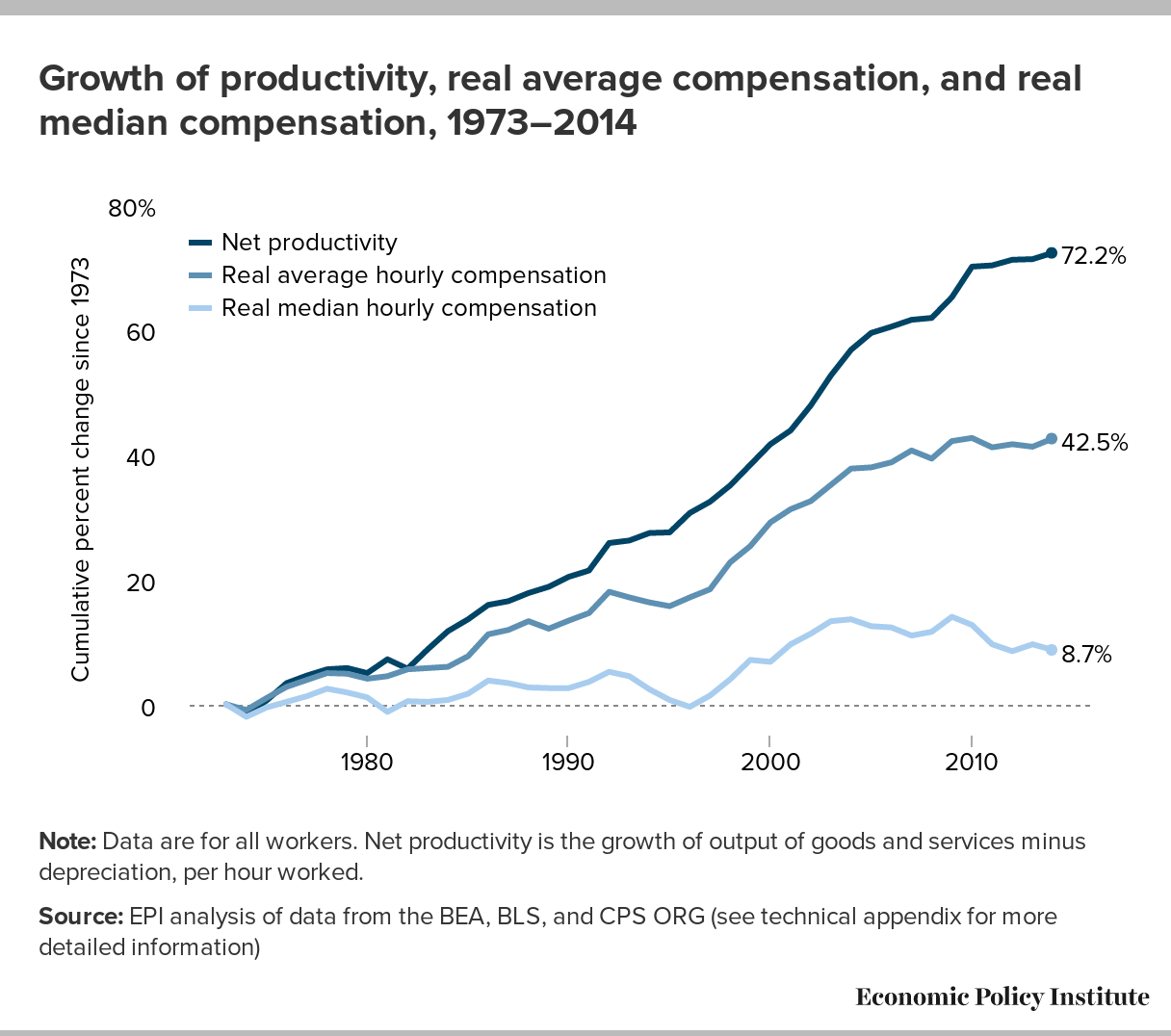
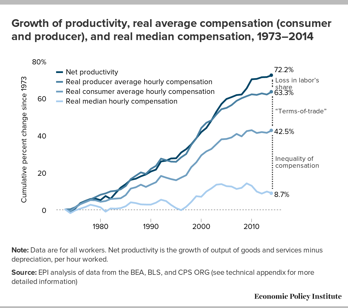
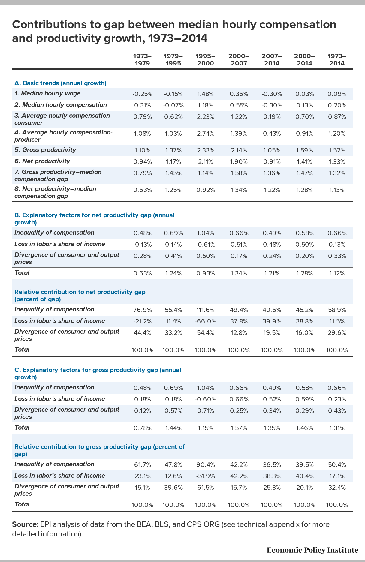
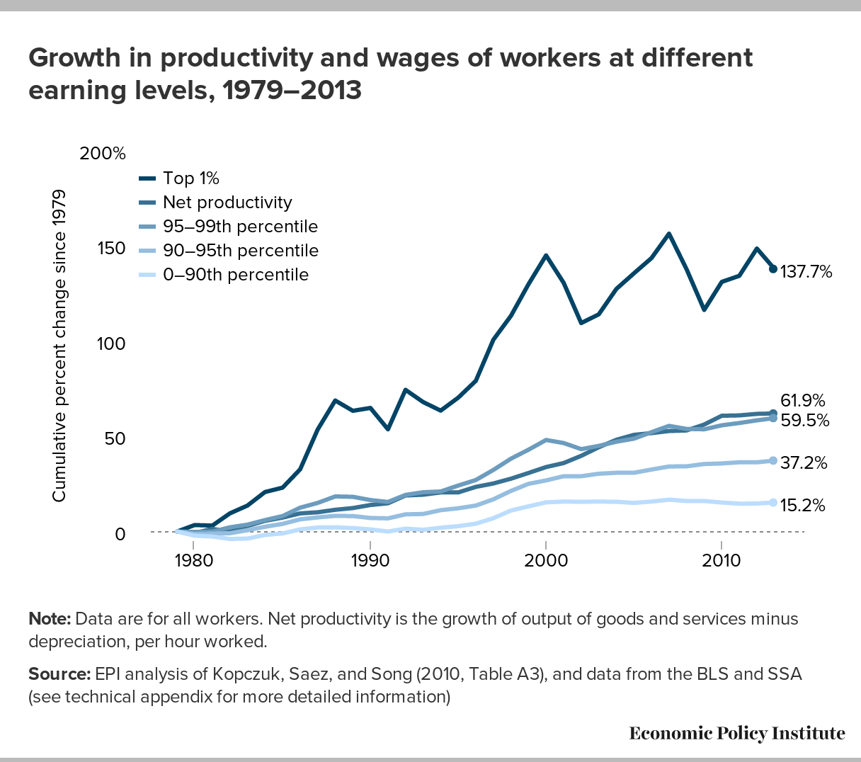
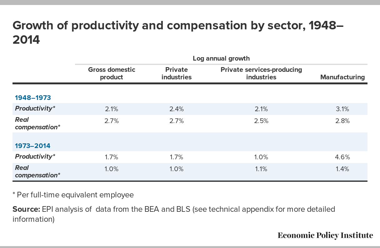
No comments:
Post a Comment